

To place social proof on a sales page, put each proof element directly beside the claim it supports: a named testimonial next to the result it describes, a customer count next to the adoption claim, a security badge next to the data-safety line. Proximity matters more than volume. Three well-placed proofs usually beat twenty testimonials parked at the bottom. The working rule is simple: evidence belongs where the claim is being judged.
TL;DR:
- Place each proof element next to the claim it supports, not in a separate testimonials section.
- Proximity reduces the work the reader does to connect promise and evidence.
- Match the proof type to the claim type: security badge for data safety, named quote for results, customer count for adoption.
- The common mistake is a proof dump at the bottom or badge soup in the header.
- Audit five claims this week and attach one proof within one screen of each.
Table of Contents
- The Principle in Plain Words: Proof Beside the Claim
- Why Proximity Beats Volume on a Sales Page
- Where To Put Social Proof on a Sales Page: The Placement Map
- A Worked Example from a Present-Day B2B Landing Page
- The Common Mistake That Breaks the Principle
- A Checklist To Apply This Week
- Put Proof Beside the Promise on Your Next Page
- Frequently Asked Questions
- Sources
The Principle in Plain Words: Proof Beside the Claim
Most sales pages treat proof as a separate department. There is a testimonials section near the bottom, a logo strip near the top, and a badge row in the footer. Each element is present. None is doing much work.
The principle is one sentence: "Use proof beside the claim it supports." That means the proof and the claim share a section, a row, or a sentence. A result quote sits under the result headline. A security badge sits in the row that promises data safety. A customer count sits next to the adoption claim. The reader does not have to remember the claim while scrolling to find the evidence.
Proximity is a processing decision. A page asks the reader to hold a promise in mind while deciding whether to believe it. If the proof is three sections away, the reader must carry the claim across a scroll, remember it, then match it to the evidence. That work creates drop-off. Proximity removes a step between promise and belief.
Why Proximity Beats Volume on a Sales Page
Social proof works as an uncertainty reducer. Nielsen Norman Group's article on social proof treats testimonials and ratings as credibility cues: they help most when they are relevant to the decision in front of the reader. Relevance includes location. A quote about fast onboarding is relevant beside the onboarding claim. The same quote in a bottom-of-page carousel is just another block of text.
The direct-response masters were not subtle about this. Claude Hopkins built ads from reason-why specifics. David Ogilvy insisted on factual detail. Rosser Reeves repeated one claim until it stuck. All three kept evidence attached to the promise. A proof that floats free of the claim asks the reader to do the matching. Most readers will not bother.
Volume creates a second problem. A page with twenty testimonials signals that the writer had a lot of proof. It does not signal that any one quote answers the claim the reader is judging. A page with three proofs, each placed beside a different claim, gives the reader three chances to believe the argument at the moment it matters. Specificity and position do more than quantity.
Treat one screen as the limit. If the proof sits farther from the claim, treat it as absent.
Where To Put Social Proof on a Sales Page: The Placement Map
The placement decision starts with the claim type. A logo proves adoption. A result quote proves outcome. A standard badge proves process. A customer count proves scale. Put the proof where the claim is being judged, and use the proof type that actually answers that claim.
| Claim type | Proof to place beside it | Where it goes |
| Result: "cuts close time" | Named customer quote or case snippet | Under the result headline or beside the metric row |
| Adoption: "used by teams like yours" | Customer count or segment-matched logos | Next to the adoption sentence, not in a separate logo strip |
| Security: "your data is safe" | SOC 2, ISO 27001, or encryption note | Same row as the security claim, near the form or pricing table |
| Speed: "set up in an afternoon" | Onboarding time or implementation note | Beside the setup claim and near the call to action |
| Support: "real humans" | Response-time promise or support example | Beside the support claim or chat widget |
| Price/value: "pays for itself" | ROI quote or named result | Next to price and guarantee, not in the FAQ only |
| Review rating: "well reviewed" | Star rating or review count | Beside the recommendation claim or product summary |
Nielsen Norman Group's credibility research finds that users judge trust quickly and look for specific signals. A badge in the footer is a signal, but it is not a signal at the point of doubt. The same badge next to the data-safety claim does more because it meets the objection when the objection forms.
Pro Tip: Put the strongest proof where the reader is about to make a decision, not where the page looks balanced. That is usually beside the price, the submit button, or the risk-reversal line. A proof that sits next to the buy button answers the last objection before it forms.
A Worked Example from a Present-Day B2B Landing Page
Take a current B2B invoice-reconciliation SaaS page aimed at finance teams. The top claim is that the product shortens the monthly close. The proof near that claim is a customer quote that names the old close time and the new one. The quote sits in the same section as the claim. It does not wait in a testimonials carousel.
Further down, beside the security line on the pricing table, the page places its SOC 2 badge and a short encryption note. In the integration section, the proof shifts to named customer logos that use the same accounting stack. Each proof answers the question raised by the claim next to it. The page still has a testimonials section, but it gives readers who want more depth a place to go. It is not the first place proof appears.
This pattern works because the page treats proof as part of the argument. A finance buyer who reads "shortens the close" wants evidence about close time. A buyer who reads "your data is safe" wants a standard or an audit. The proof shifts to match each claim.
The Common Mistake That Breaks the Principle
The obvious placement is a dedicated testimonials section. It is also the weakest placement for most claims. A page collects every quote, logo, rating, and badge into one section near the bottom and calls it social proof. The reader meets the claim at the top, forms a judgment, and then scrolls through a wall of praise that may not address the claim. The proof arrives after the decision has already started to set.
A second mistake is badge soup. A row of security and payment logos sits near the header, far from the data-safety line or checkout risk it is supposed to reduce. The badge is visible, but the reassurance is not. A third mistake is the rotating testimonial carousel. Motion hides proof: the reader cannot compare the quote to the claim because the quote changes before the comparison is made.
A testimonial at the bottom of the page is a receipt, not a sales argument.
The UK Competition and Markets Authority has warned businesses about fake or misleading online reviews. Placement does not fix a proof that cannot be substantiated. It only makes a weak proof easier to see. The FTC's Endorsement Guides require that testimonials reflect honest opinions and that advertisers have evidence for claims. Put proof beside the claim, and make sure the proof is real.
A Checklist To Apply This Week
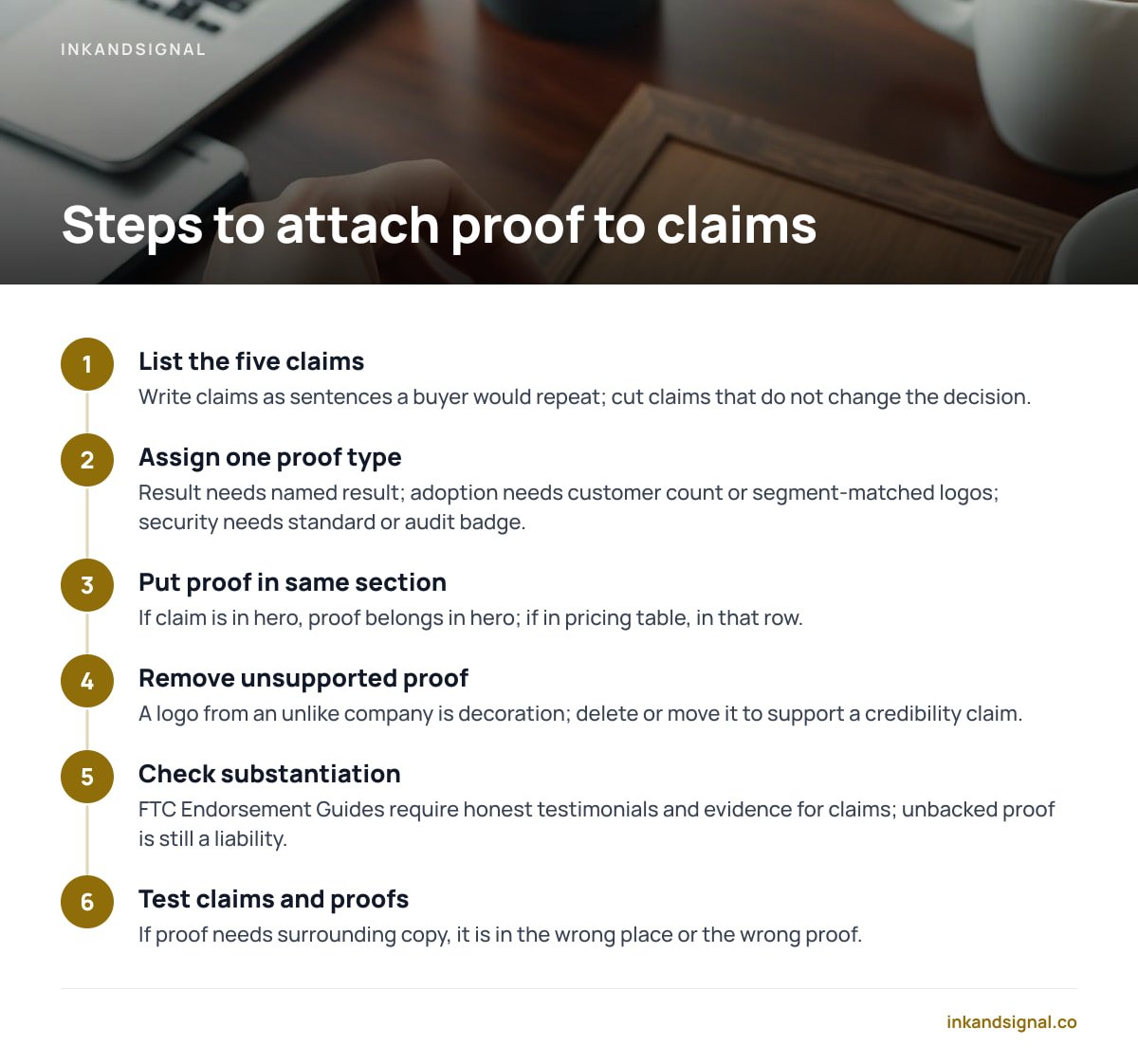
List the five claims that carry the page. Write them as sentences a buyer would repeat. If a claim does not change the decision, cut it before you place proof.
Assign one proof type to each claim. A result claim needs a named result. An adoption claim needs a customer count or segment-matched logos. A security claim needs a standard or audit badge.
Put the proof in the same section as the claim. If the claim is in the hero, the proof belongs in the hero. If the claim is in the pricing table, the proof belongs in that row.
Remove proof that supports no claim. A logo from a company unlike your buyer is decoration. Delete it or move it to a page where it supports a credibility claim.
Check the substantiation. The FTC's Endorsement Guides require honest testimonials and evidence for claims. A well-placed proof that cannot be backed up is still a liability.
Test the page by reading only the claims and proofs. If the proof does not make sense without the surrounding copy, it is in the wrong place or it is the wrong proof.
Put Proof Beside the Promise on Your Next Page

If you want a practical system for pairing claims and proof, Inkandsignal sells The Direct Response Marketing Playbook. It is a 48-page PDF for $37. The book condenses a century of direct-response advertising into 8 masters, 10 systems, 100 principles, 30 example ads, and a 30-day campaign build. The 100 Principles checklist is the part to use this week: take five claims, attach proof beside each one, and rewrite the page section by section. ReplaStats, ReplaChat, ReplaCRM, ReplaTicket and ReplaGrowth apply the same method to tracking, chat, CRM, support and growth work. The free principle card deck sample lets you test the format before you buy.
One caveat: the playbook is a PDF, not a done-for-you audit. You still have to run the tests and check the spec sheet, including ours, before you buy. Placement takes practice page by page.
Frequently Asked Questions
Should testimonials go above or below the fold?
Put them beside the claim they support. If the main claim is above the fold, a short proof line belongs there; if the claim appears lower, proof follows it there. The fold matters less than the pairing.
How many testimonials should a sales page have?
Enough to cover each major claim once. Three to five specific proofs often beat a wall of generic praise. Remove duplicates that do not answer a specific objection.
Where do trust badges belong?
Next to the exact risk they reduce: a security badge beside the data-safety line, payment logos beside checkout, a guarantee beside price. A badge row in the footer is a receipt, not a reassurance.
What if I only have one testimonial?
Place it beside your strongest claim and make the claim narrower so the proof fits. One specific quote beside the right promise beats ten vague quotes at the bottom.
Do customer logos count as social proof?
Yes, when they are relevant to the buyer. Put logos beside the credibility claim they support, not in a generic strip. A logo from a company unlike your buyer adds little.
Sources
- Trustworthiness in Web Design: 4 Credibility Factors | Nielsen Norman Group
- FTC Endorsement Guides: What People Are Asking | Federal Trade Commission
- Online reviews and endorsements: advice for businesses | Competition and Markets Authority
Leave a Reply